
An Accessible Non-Profit Homepage
That Drives Donations
Problem
Value Delivered
In this project, I reduced time-to-donation access by 60% for keyboard users, and further optimized the donation flow to remove friction and maximize contributions.
Why Accessibility Matters
Improving the accessibility of a non-profit’s website isn’t just about compliance, it’s about impact. Accessible design enhances usability for all users, not just those with disabilities. For non-profits, this means increasing engagement, trust, and ultimately, their ability to fulfill their mission.
1
Increased Traffic
Users with disabilities often face exclusion. By addressing accessibility issues, non-profits can tap into a broader audience and increase traffic.
2
Greater Trust in the Organization
Clear and accessible websites reduce frustration and create a better user experience, leading to stronger credibility.
3
More Donations
Improving readability, keyboard navigation, and form clarity removes friction and encourages higher conversion rates.
4
Higher Volunteer Involvement
An accessible website ensures that more people, including those with disabilities, can easily sign up and participate, leading to a more diverse and engaged volunteer base.
5
The Right Thing to Do
Accessibility aligns with the core values of most non-profits: inclusion, equity, and service.
A commitment to accessibility ensures everyone, regardless of ability, can engage with an organization’s work.
By investing in accessibility, non-profits don’t just improve their websites—they expand their reach, build stronger relationships, and create a more inclusive world.
How Accessible Homepages Drive Donations
The homepage plays a critical role in driving donations by quickly communicating the organization’s purpose and building trust with potential donors.
Nielsen Norman Group identified key information users need to know before they feel comfortable making a donation:
Type of Information
% of users who wanted to know this information
Mission, goals, objectives, and work
62%
Use of donations and contributions
57%
Legitimacy and reputation
57%
Local presence
19%
Site security
15%
Nielsen Norman Group. (2018). Attracting Donors and Volunteers on Non-Profit and Charity Websites.
A clear, accessible homepage that provides this information up front helps reduce cognitive load, builds credibility, and empowers a broader audience—including people with disabilities—to engage with the organization and contribute financially.
Before and After
I audited 40+ pages on Jeffco CTC’s website, with a particular emphasis on the homepage and global navigation. I focused on identifying accessibility barriers related to visual, motor, and cognitive impairments.
I assigned scores 1-4 for each audited item based on severity of impact on users, and prioritized the lowest scores for improvements.
Before
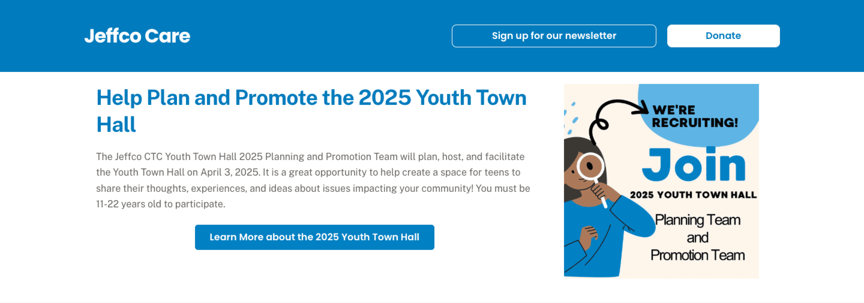
It took 10 tab clicks (!) to navigate the webpage and finally arrive at the “Donate” button using the keyboard.
That is because JeffcoCTC’s “Skip to Content” button placed keyboard users at the beginning of a decorative banner with 5 images, forcing users to tab through each image and a newsletter subscription button before being able to donate.

After
Because the banner was decorative, I chose to reuse the images elsewhere on the homepage.
By removing the banner and moving the newsletter subscription button to the footer, I reduced the time it takes to arrive at the “Donate” button by 60% (from 10 to 4 seconds) for people who use keyboards to navigate the web.
I also added a dedicated donation button in the navigation bar so that users can quickly donate even when they’re away from the homepage.

Before
According to Nielsen Norman Group, every non-profit homepage has to answer the two most important questions users have when deciding to donate to an organization:
What does the organization do?
and
How will my donation be used?
Jeffco CTC answered these questions on the About Us page, but not the homepage, making it more difficult for users to determine immediately whether they should donate.
After
To maximize the flow of donations, I added a section under the header banner describing the organization’s mission, vision, and values, and followed it by a quick donate section with pre-set donation amounts.
This flow ensures users have answers to their two most important questions and are immediately afforded an opportunity to donate making them more likely to give to the organization.

Before
According to NNG, users want to know their information will be protected before submitting their personal and billing information through a donation form.
Jeffco CTC’s website did not have a policy section outlining how user data was used or stored. It also did not have an accessibility policy, terms and conditions, or a copyright notification, exposing the organization to risk of litigation.

After
I redesigned the footer to add a copyright notification, tax disclosure, and links to policy documents. Adding these documents improves trust in the organization, increasing donations.

Impact
By implementing these improvements, Jeffco CTC will:
1
Increase donations
to the website by making it accessible to all, regardless of ability, reducing keyboard navigation time to the “Donate” button by 60%, and optimizing donation flows according to usability best practices.
2
Give users confidence
that their donations will go to a good cause by specifying the organizations mission, vision, and values before asking for donations.
3
Build trust in the organization
by including important policy documents that specify how user data is used and stored.
Key Takeaways
Technologies and Skills
Accessibility audit
Chrome Inspect Tool
SilkTide
Secondary research
Figma
Wireframing
Prototyping
Usability Testing